This post will tacle the topic of primary colours in game design. I will try to go over both, character design and environment since the principles here are very similar. In this article I shall only include the primary colours and the basics of colours since taking more will make the text far longer. I shall later make a follow-up post to describe other important colours and specifics. I hope, this post will be of use to those who are interested in character design and drawing.
Shades, Tints, Tones & Hues
First things first, what’s the difference between all the hues and shades that artists so often talk about? Well, in short, a hue is a pure colour either primary (Red, Blue, Yellow) or secondary (Purple, Green, Orange). Even tertiary colors can be considered hues but most importantly, they should not have any white, black or grey mixed in them. Consequently, the rest of terms – shades, tints, and tones – are hues mixed with the white, black, or grey. To be more precise, shades = hue + black, tints = hue + grey, and tones = hue + white.

Hues
The general remark that I wish to give on the hues is to look at whether the hue is warm or cold when you are choosing a colour for the design. Warm colours usually have got more red and yellow in them, while blue are more prevalent in the cold hues. This is important to note because a warm palate is used for comfort, security and love. On the contrary, colder palate is meant to show hostility, danger or isolation.
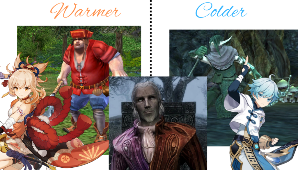
It is especially important when you try to set the tone of the scene, and, no, this time I do not talk about the colour tone, but rather the atmosphere. It may be easier for same of you to associate warm colour with major key in music while the cold colour represent the minor key. I hope, this metaphor helps.
Shades
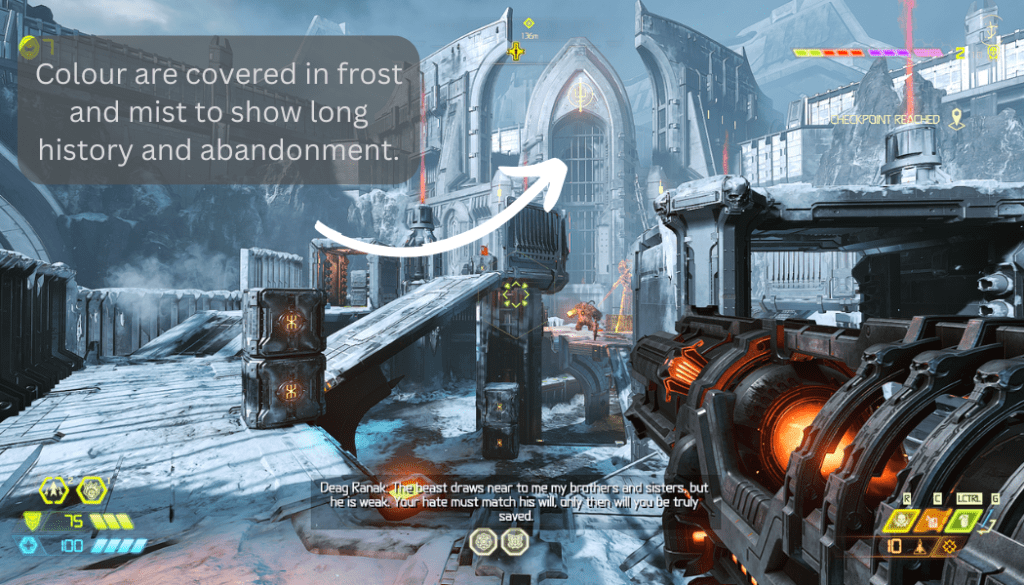
Hues mixed with black. Shades are often used to create shadows or show shady characters.
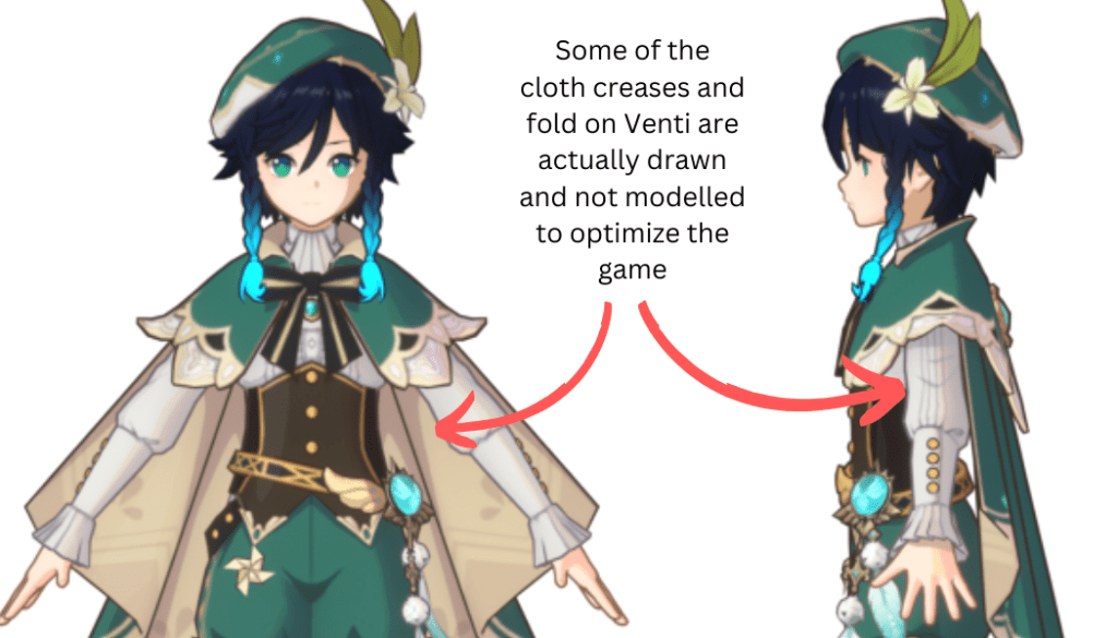
Hoyoverse uses it a lot in its character models to make the performance better.
Tints
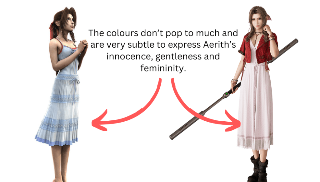
Hues mixed with grey. They seem much duller than hues since the grey basically washes away the vibrancy of the colours. It’s great to show something bleak or mundane. Tints can also help create a sense of a long time gone. Think of it as the colours starting to have silver hair from old age.
Tones
Hues mixed with white. They are rather vibrant, but when the white is too saturated, tones can be great hints of colour here and there in order not to make the design less boring and to give it more shape.
The Big Three: Red, Blue & Yellow
These three colours are the primary colours that are used to create the rest. Some may find them pretty basic and that’s the whole point. However, by no means basic means bad. It’s the foundation on which the rest of the colour symbolism stands.
Red
There are a few main meaning to it: danger, courage, blood and heroism. It can be many other things as well, especially in a specific setting. For instance, in Doom series, you may most likely associate red with Hell, or if you play Genshin, it will be the colour of pyro and fire to you. Either way, it’s you who decide what a certain colour represents in your game but, please, be consistent in your references.
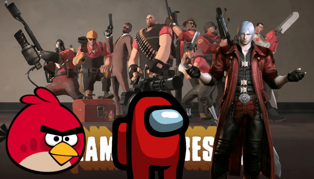
As for the primary meaning I’ve mentioned, I guess, it’s easy to understand that red is the alarm colour, hence danger; blood and courage go hand in hand in a battlefield, but heroism I’ve added mostly because of Team Fortress. It’s true that in the majority of shooters, it’s the enemy team that’s colouerd red and yours is blue, but not Team Fortress. There, the main team is flashy red.
Blue
To continue with, both red and blue are common colours for capes of the hero or king characters to wear. The colour may depend either on the setting or the main trait the colour means to compliment. Red shall show bravery and leadership, while blue may be used more to represent level-headedness and nobility.
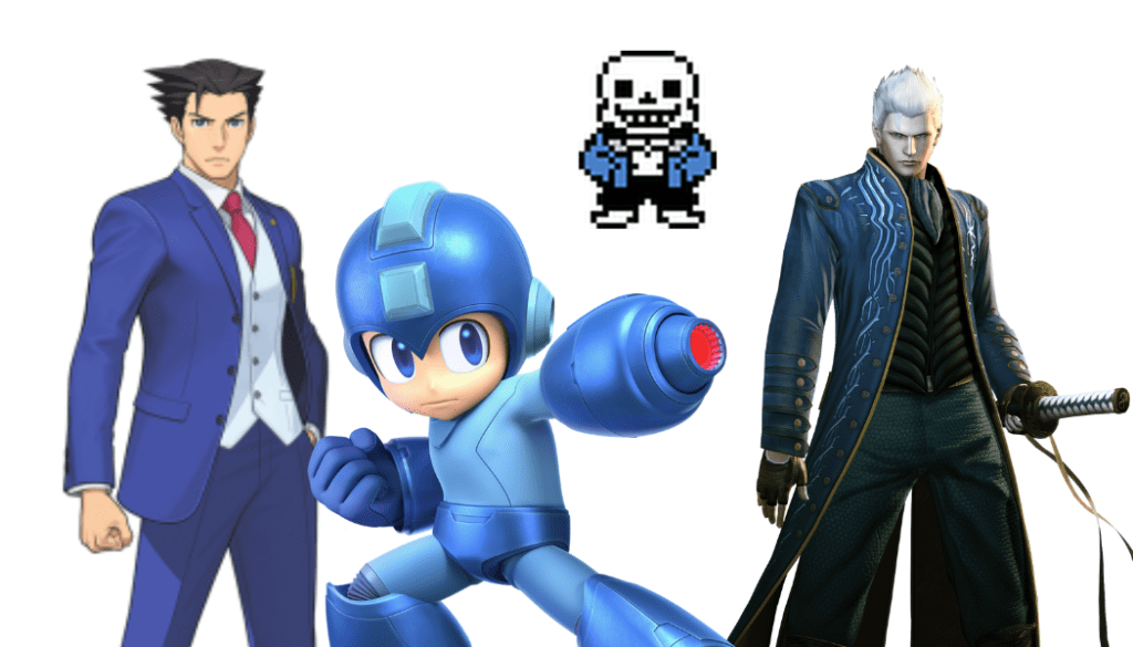
In general, blue can mean many things: from clear blue sky to water. Blue is the colour of sadness but also calmness and wisdom. It often contrasts with red in concept but not always. As it has been previously mentioned, blue and red often show some opposing elements in the game’s interface since both are primary colours which are easily distinguished (unless you are colour blind).
Yellow
It’s a bit of a tricky colour since unlike the other two primary colours it does not appear so much on it’s own. More often it’s a certain hue of yellow but rarely the primary example.
It is meant to represent energy, joyfulness and optimism. Although, at the same time it can show either danger or caution.
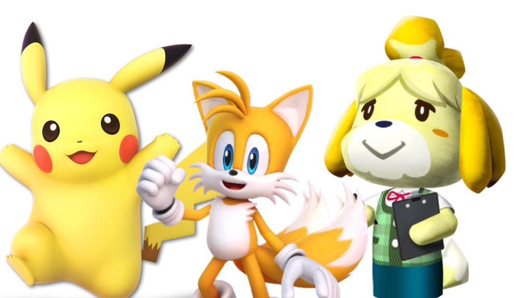
Yellow can also serve as a great accent colour since it’s usually rather bright, it’s hard to use it on large objects, but its shades and tones can help liven the design greatly.
In the follow-up post I will try to describe some conventional uses of colours in video games. There’s a lot to describe there but this time I have only shown the basics.

Leave a comment