Ado (アド) is a Japanese singer and songwriter whose career skyrocketed with the debut of her song “Usseewa” (“Shut up”). She rocked the Internet with her provocative song and resonated with hearts of millions around the world. It’s undeniable that her music is wonderful and her performance is superb but this post is about the art styles of a few of her songs. I would like to explain how well it compliments her lyrics and the tone of the songs since not many people talk about great the visual representation of her songs actually is.
For this post I would like to talk about the visuals in three clips of Ado, namely, “Usseewa” (うっせぇわ ), “RuLe”, and her new song “Elf” (エルフ). It’s not the most thorough analysis of the songs’ visuals but there are some elements that are worth discussing.
うっせぇわ
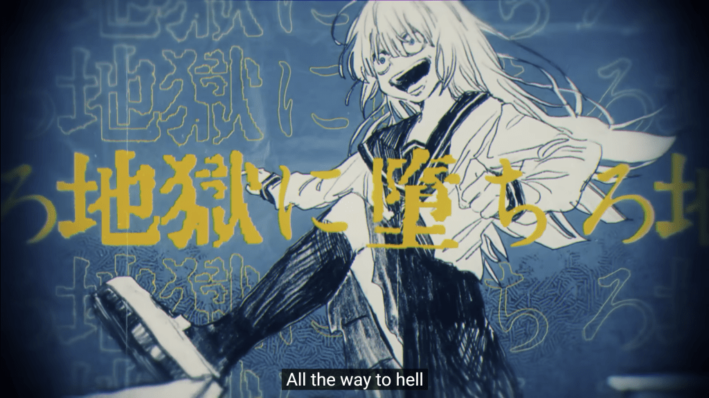
This song debuted in 2020 and is still be most popular song of Ado to this day. It is her protest against strict rules of Japanese society that don’t always make sense and many times praise conformity over individual perception.
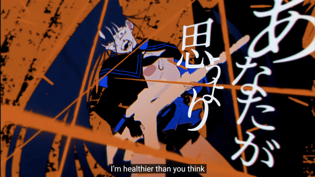
Talking about it’s visuals I want to note the primary colours that are used to convey ideas: blue, red and white.
- Blue – the somber colour of the heroine. It is used to contrast the rules of society indicated by:
- Red. It’s the colour of danger and societal norms.
- White – the colour of the heroine’s weapon. It is literally meant to represent light that “shines” upon the world aroud her.
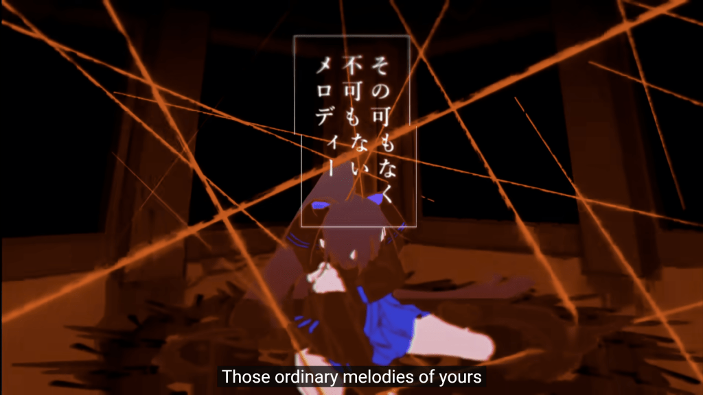
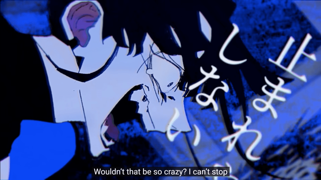
Another element that I wish to discuss is how words of the lyrics are shown to the viewer. Most of the time they are all over the screen and many times are a bit distorted. It is also a for of protest against conformity of making the text easily accessible.
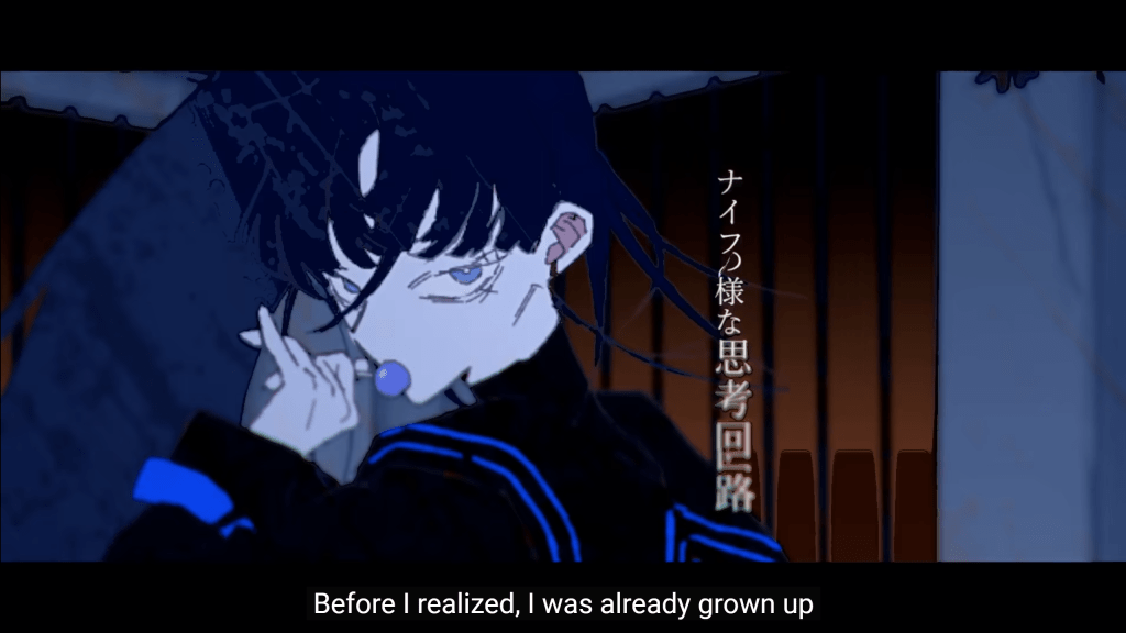
Second to last thing is the sexualisation of the clip’s protagonist. It is not directly connected to the words of the song but I find it concerning for a girl in her school uniform wears such a revealing outfit. It may be just me or the fact that I am not Japanese so I don’t get it, but it seems like a deliberate choice.
The last thing I want to mention about the style of the clip is now messy the pictures may look sometimes. It’s meant to be express emotions of the heroine better. The lines appear untidy and rough as to show how they don’t follow the norm just like the character they portray.
RuLe
A song similar to the Usseewa but not as openly agressive in its lyrics. It also wishes to break free of the rules its tired of and it does a splendid job at visually representing nonconformity.
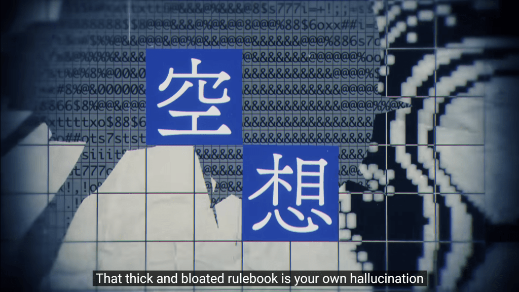
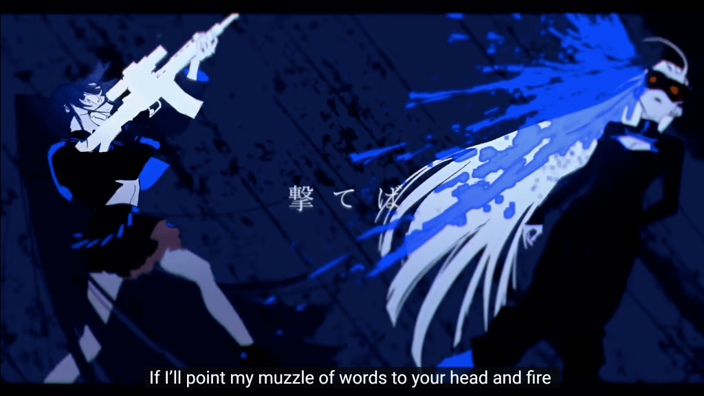
It shows many glitches and visual distortions in the text whenever it wants to emphasize the protagonist desire to break from the suffocating rules imposed on her. The very idea that the protagonist who is a lanky girl wishes to swing her chainsaw, which is most likely not meant for her composure, shows the idea of being different from standard.
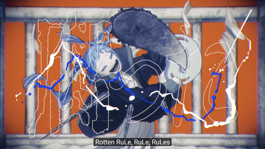
I would also want to point out that in the end, the heroine does indeed break from the RuLes which is shown in the switch of animating styles for her:
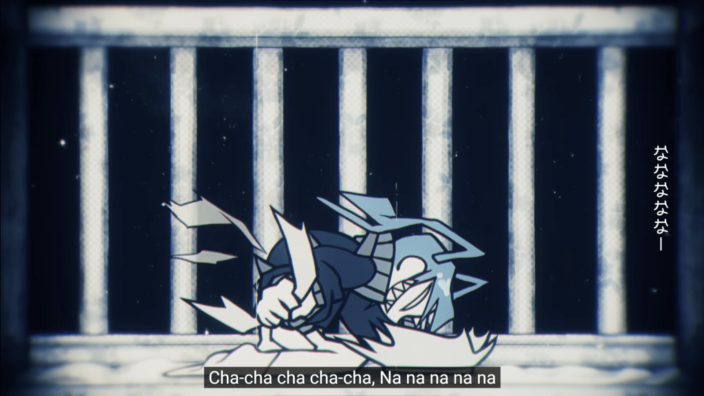
This style is not very detailed and is also full of sharp edges which are meant to represent true self of the protagonist.
In addition, just like in “Usseewa” before, messy drawing style and lyrics all over the screen help express chaos and desire to break free from the rules that hold back.
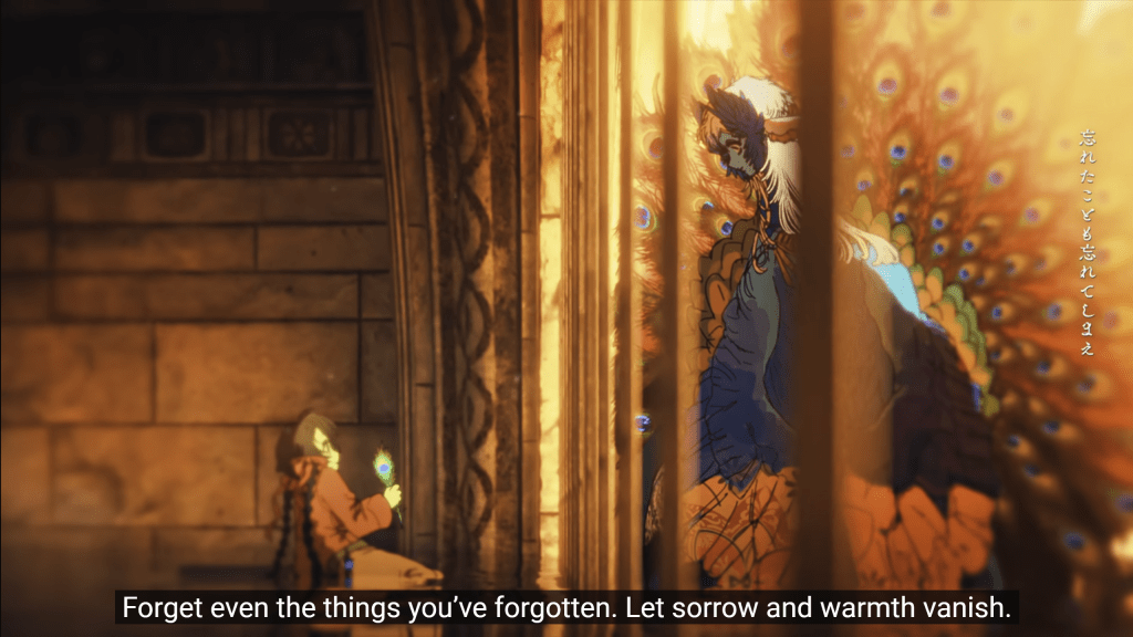
エルフ
Now this one is different from the other two songs. It’s much softer and serves as the theme song for a Japanese drama based on manga “Who Saw the Peacock Dance?”( クジャクのダンス、誰が見た?) by Rito Asami.
This song ilustrated the relationship between an Elf and his human friend. It is a has a tone of a lullaby and shows the most tender love and care I’ve seen in media in a while.
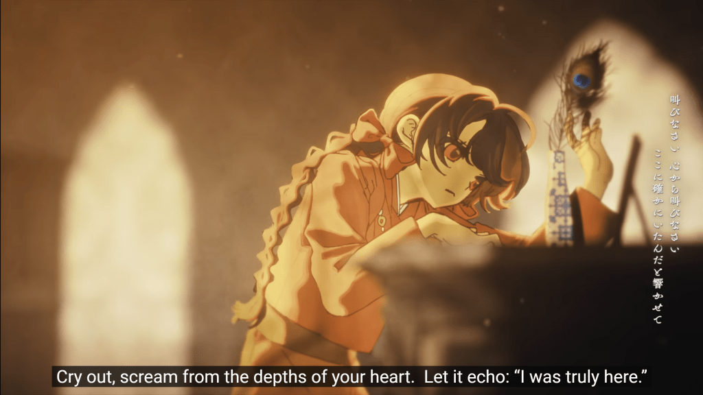
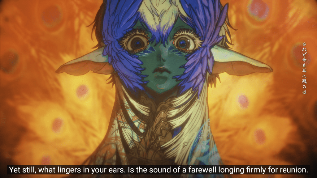
To begin with, the colors play an important role in this clip. Most of them are warm and brownish while only the peacock-elf is of bluish colours. This helps the artist (沼田ゾンビ!?)* create a visual distinction: the human world in brown while the majestic peacock is of a different colour completely. Of course, it also makes the warmth contrast against the cooler blue which makes the elf eye-catching and graphic.
*I swear it’s the artist credit as it’s written under the video.
This ultimately makes his feather to look otherworldly when it’s shown in a vase:
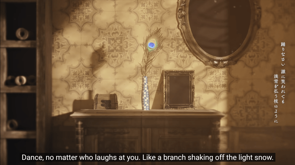
Another element that can slide by very easily is the amount of detail used to show humans and the elf. Humans are always shown in simple clothes and the city doesn’t have much decore but the elf has got many details and patterns on his design:
Another little detail that I really appreciated is when Ado was singing about the “monstrous world”, there were people shown and none of them had got faces:
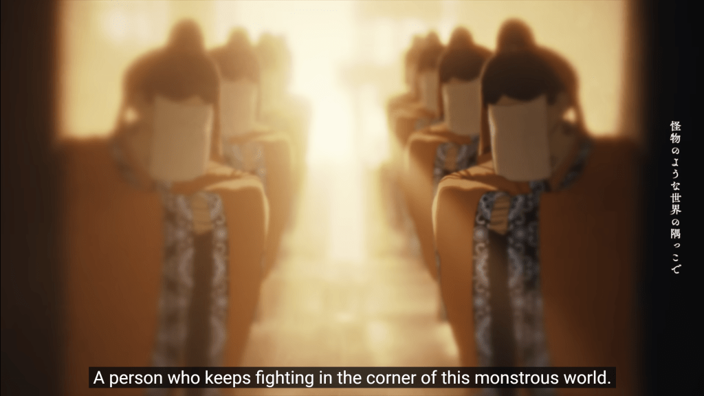
This inability to see whom you are facing against creates a sense of danger and deceit.
The last detail I want to mention is now the human protagonist wears a neclace decorated with blue eyes similar to those on the peacock feather as she grows up.
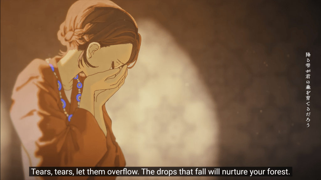
This allows us to see that after many years of separation she couldn’t forget about the Elf and still cherishes the memory of him.
These are all the visual elements I wanted to talk about today. They might be quite obvious to some people but I hope you have discovered something new today either way.
Also, if some of you believe that this post was meant to be an excuse to talk about the Elf video because I have rewatched it a few dozen times by now, well… I will neither confirm nor deny it. Have a nice day and, please, do tell me if any of you are interested in either a more in depth analysis of a particular animation or simply want more overviews like this one.

Leave a comment